We built Gradescope to give instructors grading superpowers. We believe that all instructors, anywhere on Earth, should be able to use Gradescope to:
- Build and grade their own content
- Grade questions of all types, not just multiple-choice
- Give students a lot of feedback
- Analyze student learning
- And do it 10x faster than ever before!
Saving time on grading and associated administrative tasks allows instructors to focus, spend more time interacting with students, and improve instruction.
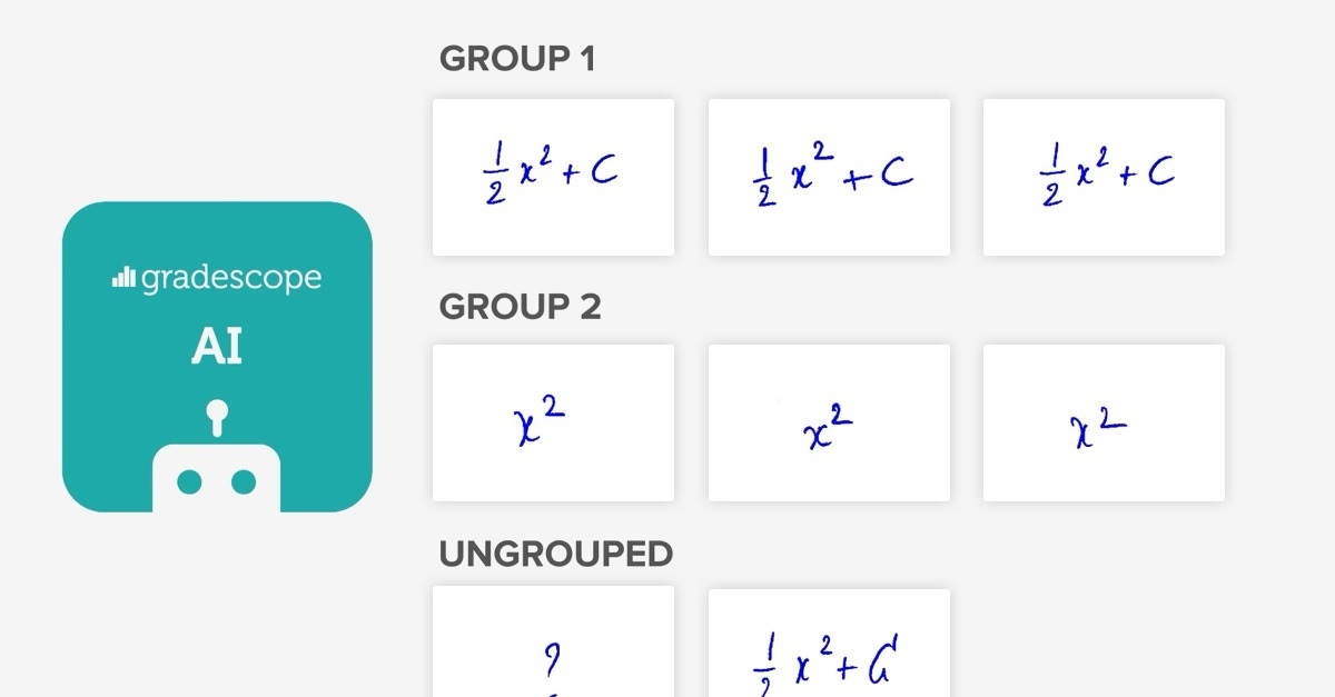
One of our solutions for achieving this is AI-Assisted Grading. This feature of our web application enables instructors to first sort student answers into groups, and then grade whole groups at once. For some question types, Gradescope AI can automatically sort student answers into groups, saving instructors even more time.
The AI-Assisted Grading feature is a result of close collaboration between our AI, Design, and Web Development teams. In this post, we explain our motivation behind this pursuit, followed by the three principles of AI Product Design that guided our collaboration.
Motivation
In order to make sense of the innovation of AI-Assisted Grading, let’s first review the basics of Gradescope. While Gradescope supports PDF, Online, Programming, and Bubble Sheet assignments , I will cover only PDF assignments in this post.
Here’s how it works:
The instructor first uploads an assignment template and indicates the region of each question.
Then, the instructor is able to grade each student’s answer to a question, focusing on the question region indicated in the previous step, and building up a rubric as they go.
While this digital answer-by-answer grading is powerful and provides substantial time-savings over grading on paper, there are still some major inefficiencies in the process.
The main inefficiency is that the instructor sees the same answer (from different students) more than once. If most students got the right answer, then most of the instructor’s time will be spent looking at the exact same answer and grading it the exact same way!
To remedy this, we developed an AI engine to read student handwriting. This would allow Gradescope to automatically place student answers into groups, each containing a unique answer.
But while AI is an increasingly powerful technology, it is still not perfect. Grading is one of the most crucial tasks in education, and it is important to avoid mistakes. We needed to design a user interface that would allow instructors to verify that the answer groups formed by the AI were fully correct, and to easily fix mistakes if they were not.
This interface would need to communicate the result of a complicated process to the instructor and make them feel comfortable, effective, and delighted. The following three principles guided us in achieving this.
Principle 1: Speak the user’s language
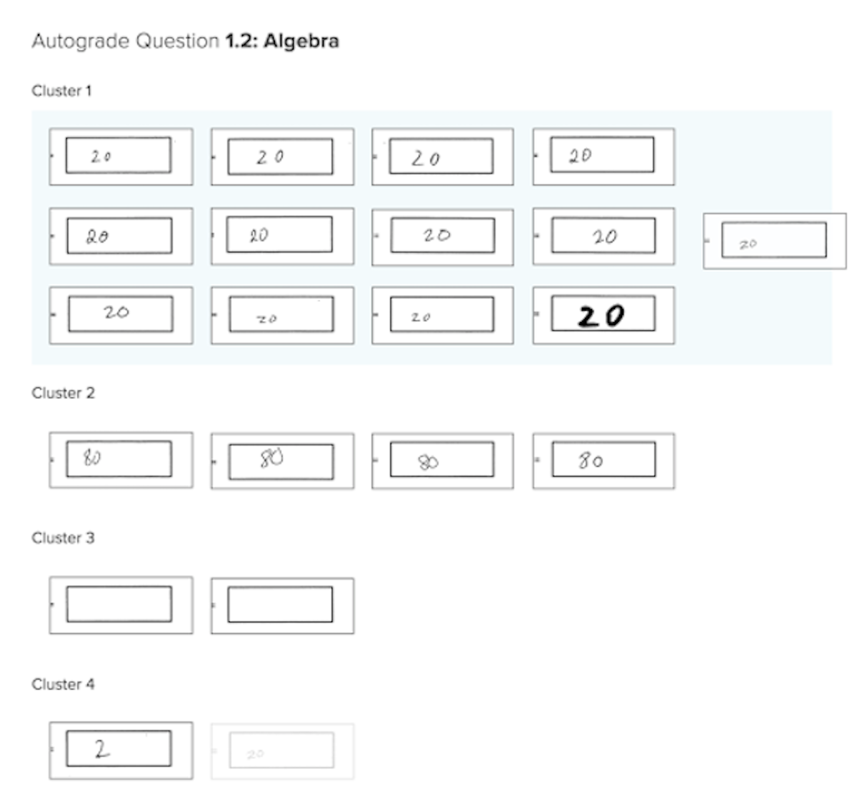
In the early versions of the interface, we used the term “cluster.” In AI, this term refers to techniques for automatically forming distinct groups of items, which is exactly what the product was doing.
The term is accurate, but we quickly realized that it did not have the same meaning for our users as it did to us. Instead, we decided to use the word “group,” which is just as accurate, but more relevant to the user.
This illustrates the first principle of designing AI products: speak the user’s language. The user does not know (and usually is not interested in) how the product’s engine works. They simply want a fast, functional interface that makes sense to them. Using words that make the most sense to the instructors enables them to effectively use the feature as quickly as possible.

An early version of the interface, showing all answers to a question on a single page, arranged under cluster (group) headings, and allowing the dragging of answers between clusters (groups).
Another example of not speaking the user’s language is the word “autograde” in the screenshot of our early prototype above. We were careful to remove this word from the final versions of the interface because Gradescope AI does not autograde. It only assists the grader in forming answer groups, and requires the grader to sign off on the groups before grading.
Being precise with our language here lets the instructor know exactly what our mission is: to assist them, not replace them (which is where a lot of people’s minds tend to go upon any mention of AI).
Principle 2: Details matterThe AI-Assisted Grading feature is complex: there are many interacting parts to it. The goal of a successful user interface is to make this complex feature simple to use.
No amount of design work will produce an interface that is as simple as possible. Eventually, you must watch actual people use the interface, notice where they struggle, and improve.
For this reason, as soon as the AI-Assisted Grading interface was somewhat usable, we started inviting Gradescope users to alpha-test it. Our office was located close to UC Berkeley campus, so over a dozen of teaching assistants and instructors found it easy enough to come by on their lunch break.
We would sit next to a user, and silently observe them try to figure out the novel interface. We would watch with dismay as they skipped right past a pop-up with instructions. We would squirm as they struggled to find a clearly visible button. We would notice them try to use keyboard shortcuts, to no effect.
The interface for assigning ungrouped answers to groups.
Every single session led to important insights about how things should work. As a result of these sessions, we implemented countless improvements, such as:
- Dragging answers into an answer group (almost all users attempted this intuitively)
- Being able to easily change the zoom level of the answers (some users wanted to see a grid of answers, but others wanted to see answers almost one-by-one)
- Keyboard shortcuts for zooming, navigating, and assigning answers to a group.
Individually, these are all small features, and no single one of them is crucial. But in combination, they make a user interface so intuitive, polished, and delightful, that the user feels safe. They can tell that we really care about them and that our product is built with them in mind.

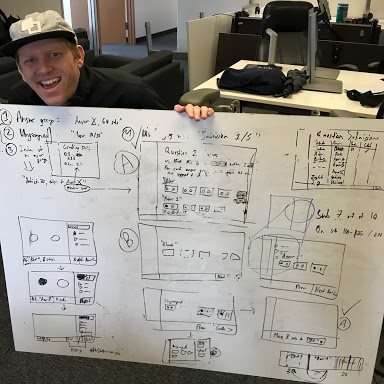
Gradescope UX Designer Kevin Gutowski holding a whiteboard with an early interaction flow of AI-Assisted Grading interface.
When the user reviews answer groups formed by Gradescope AI assistance, they are interacting with AI. The interaction should be delightful, sure. But most importantly, it should be beneficial to the user.
This is why we do not ship AI-powered features until the AI engine is good enough to make a major difference to the user experience. For example, it should save a significant amount of time, without requiring much extra work from the user.
Still, occasionally our AI makes a mistake. This is why we painstakingly designed the interface to allow the user to quickly and effectively correct mistakes. And when the user corrects a mistake that the AI made, that is beneficial to the AI!
Here’s what we mean by that: an instance of a user overruling AI is a valuable example from which the AI itself can learn. Most AI applications today learn using large sets of examples (for instance, images of handwritten words, and their corresponding text representations). The more such examples can be provided, the better the AI will get.
Of course, this flywheel effect doesn’t just happen on its own. It requires a lot of work from Design, Web Development, and AI teams. User interactions must be designed in such a way that useful data is generated, then stored in the right place, and finally used for AI development. As we have with all product enhancements and developments, we will keep these three principles in mind as we look to the future of Gradescope and AI.


